White cabinets have long been the backbone of kitchen design, timeless, clean, and versatile. But left on their own, they can read as clinical or bland. That’s where warm colors come in. The right palette can turn a stark white kitchen into a welcoming, lived-in space without sacrificing the brightness those cabinets provide. This guide walks through proven warm kitchen paint colors with white cabinets, accent finishes, and design strategies for balancing light and cozy tones. Whether repainting walls or updating hardware, these kitchen paint ideas with white cabinets will help create a space that feels both functional and inviting.
Table of Contents
ToggleKey Takeaways
- Warm kitchen colors counterbalance the clinical feel of white cabinets by introducing reds, oranges, and yellows that ground the space visually and create a welcoming atmosphere.
- Top paint color choices for white cabinets include greige, terracotta, sage greens, and warm whites, with soft neutrals working universally and bold hues like burnt orange best used on accent walls.
- The 60-30-10 design rule allocates 60% to white cabinets, 30% to wall color, and 10% to accents, preventing any single element from overwhelming the space.
- Warm kitchen colors pair effectively with brass or copper hardware, natural stone backsplash, and warm-toned countertops and flooring to create a cohesive, inviting design.
- Always test warm paint samples on at least two walls (sun and shadow) for 48 hours and observe them under different lighting conditions before committing to avoid color shifts.
- Warm lighting (2700K–3000K bulbs) and textured elements like woven accents enhance the warmth of white cabinets while maintaining the brightness and functionality of the space.
Why Warm Colors Transform White Cabinet Kitchens
White cabinets reflect light efficiently, which is why they’re a staple in small or poorly lit kitchens. But that reflectivity can also amplify cold undertones, especially in north-facing rooms or spaces with LED lighting that skews blue. Warm kitchen colors counterbalance this by introducing reds, oranges, and yellows that ground the space visually.
Warm paint colors also shift the psychological tone. Cool whites and grays can feel sterile in a kitchen, which is usually the most-used room in the home. Warm tones, think terracotta, honey, or sage with a golden base, invite longer conversations and make the space feel less like a showroom.
From a design standpoint, warm hues create contrast without harsh lines. White cabinets need something to play against, or they disappear into white walls. Adding warmth via wall color, backsplash, or flooring gives the eye a focal point while keeping the overall palette cohesive. This approach also future-proofs the kitchen: warm neutrals age better than trendy grays that can date quickly.
Finally, warm tones are forgiving. They hide minor imperfections in drywall texture or uneven lighting better than stark whites. For DIYers tackling a repaint, that means fewer coats and less fussing over perfect coverage.
Best Warm Paint Colors to Pair with White Cabinets
Choosing the right kitchen paint colors white cabinets depends on lighting, existing finishes, and how bold one wants to go. Below are the most reliable options, broken into soft neutrals and bolder accent hues.
Soft Neutrals and Earthy Tones
Greige (gray + beige blends): Colors like Sherwin-Williams Accessible Beige (SW 7036) or Benjamin Moore Revere Pewter (HC-172) are workhorses in white-cabinet kitchens. They read warm without skewing pink or yellow, which can clash with cool-white cabinet finishes. These shades work in both north- and south-facing kitchens and pair well with stainless steel or brass hardware.
Warm whites and creams: Not all whites are created equal. A warm white like Benjamin Moore White Dove (OC-17) or Sherwin-Williams Alabaster (SW 7008) adds subtle warmth without introducing obvious color. These are ideal for small kitchens where darker walls might close in the space. Use a satin or eggshell finish for walls, it’s wipeable and hides minor surface flaws better than flat paint.
Terracotta and clay tones: Colors in the SW 6320 (Cavern Clay) or BM 2166-30 (Sedona Clay) range have surged in popularity. They bring earthy warmth and pair especially well with natural wood accents, open shelving, or butcher-block countertops. These tones work best on a single accent wall or lower half of the kitchen if using a two-tone approach. Kitchen design experts often recommend testing a sample on a 2′ × 2′ poster board and observing it at different times of day, morning light will pull different undertones than evening incandescent bulbs.
Sage and olive greens: Warm greens with a yellow or gray base, like Sherwin-Williams Softened Green (SW 6177) or Benjamin Moore October Mist (1495), add color without overwhelming white cabinets. These shades work in farmhouse, transitional, and even modern kitchens. Avoid cool-toned greens like mint or seafoam, which will fight visually with warm finishes.
Bold Warm Hues for Statement Walls
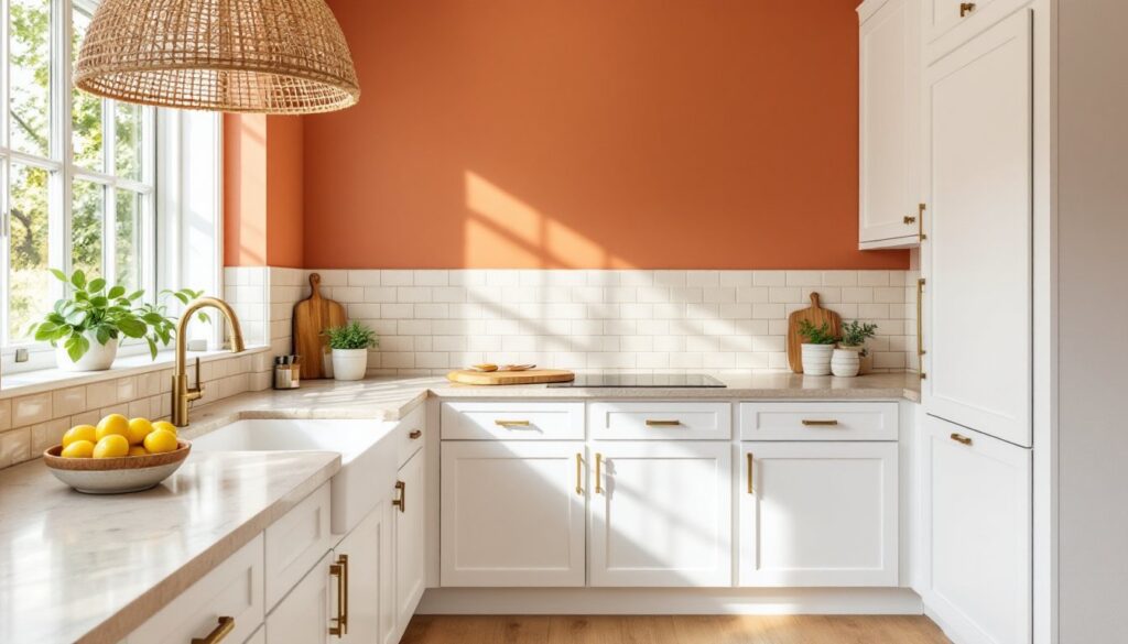
Burnt orange and rust: For DIYers wanting drama, a single accent wall in Sherwin-Williams Copper Mountain (SW 6356) or a custom-mixed burnt orange can anchor the space. This works best in kitchens with ample natural light and neutral flooring. Pair with matte black or oil-rubbed bronze hardware to avoid a dated look.
Deep gold and mustard: Colors like Benjamin Moore Golden Honey (297) or Farrow & Ball India Yellow (No. 66) are bold but grounded. These are best used sparingly, on a single wall, island base, or in a breakfast nook. They pair well with white subway tile and natural fiber accents like jute or rattan.
Warm charcoal with brown undertones: Not all warm colors are light. A charcoal with a brown base, such as Sherwin-Williams Urbane Bronze (SW 7048), can add warmth and sophistication. This works in larger kitchens with high ceilings and plenty of task lighting. It’s also a good choice for those who want a modern look but find cool grays too sterile.
When testing paint color options, always apply samples to at least two walls, one that gets direct sunlight and one in shadow. Paint a 2′ × 2′ section and live with it for 48 hours before committing.
Choosing the Right Warm Accents and Finishes
Wall color is only part of the equation. Warm accents in hardware, backsplash, and flooring tie the whole palette together.
Hardware and fixtures: Brass, brushed gold, and copper hardware add instant warmth. For a budget-friendly update, swap out cabinet pulls and drawer handles (most use standard 3″ or 3.75″ center-to-center spacing, so replacement is straightforward). Avoid mixing more than two metal finishes in one kitchen, brass faucet and cabinet pulls, for example, with stainless appliances as a neutral.
Backsplash materials: Natural stone like travertine, tumbled marble, or zellige tile introduces warm texture. Subway tile in a warm white or cream (not stark white) softens the look. If budget allows, a terracotta or handmade ceramic tile backsplash can be a focal point. Standard backsplash height is 18″ above countertops, but extending to the ceiling (or to the bottom of upper cabinets) modernizes the space.
Countertops: Warm-toned quartz or granite, think creams, beiges, and browns with subtle veining, bridge white cabinets and warm walls. Butcher-block countertops are another option, especially for islands, and they’re DIY-friendly to install (just ensure the substrate is level and use construction adhesive plus screws from underneath).
Flooring: Wide-plank luxury vinyl plank (LVP) in warm oak, hickory, or walnut tones is durable and water-resistant, key in kitchens. Standard LVP thickness is 5–8 mm with an attached underlayment. If laying over concrete, add a 6 mil vapor barrier. For tile, go with warm terracotta, travertine, or wood-look porcelain. Avoid cool grays or white tile, which will undercut the warm palette.
Lighting: Warm lighting (2700K–3000K bulbs) enhances warm wall colors. Avoid daylight bulbs (5000K+), which can make warm tones look muddy. Under-cabinet LED strips (hardwired or plug-in) add task lighting and highlight backsplash details. When planning interior design updates, consider dimmer switches, they allow flexibility between bright task lighting and softer ambient light.
Design Tips for Balancing White Cabinets with Warm Tones
Getting the balance right means knowing where to add warmth and where to let white cabinets breathe.
Use the 60-30-10 rule: Allocate 60% to white cabinets and trim, 30% to wall color or backsplash, and **10% to accents like hardware, textiles, or decor. This prevents any one element from overwhelming the space.
Consider cabinet undertones: Not all white cabinets are pure white. Some have gray, blue, or yellow undertones. Hold paint samples next to cabinet doors in natural light to check for clashes. If cabinets lean cool (blue-white), warm wall colors provide contrast. If cabinets are warm-white or cream, stay within the same temperature family to avoid a disjointed look.
Layer textures: Smooth white cabinets benefit from textured elements, a rough-hewn wood shelf, woven pendant lights, linen window treatments. This adds visual warmth even if the color palette stays neutral.
Mind the ceiling and trim: A warm white or cream ceiling (instead of stark white) softens the overall feel. If trim and cabinets are both white, they should be the same shade or very close, mismatched whites look unintentional. Use the same paint for both for a cohesive finish.
Test in context: Paint one full wall (not just a sample square) before committing. Observe it morning, afternoon, and evening. Warm colors can shift dramatically depending on natural vs. artificial light.
Don’t forget the fifth wall: The ceiling is often overlooked. A warm white or very light greige on the ceiling can unify the space, especially in open-concept layouts where the kitchen flows into living areas.
Balance bold walls with neutral floors: If painting a statement wall in terracotta or mustard, keep flooring neutral (light oak, beige tile). Conversely, if flooring is dark or heavily patterned, stick to softer wall tones.
Conclusion
Warm kitchen paint ideas with white cabinets are all about balance, adding enough color and texture to create a welcoming space without overwhelming the clean lines of white cabinetry. Start with wall color, layer in warm finishes and accents, and test everything in your actual lighting conditions. With the right palette and a bit of prep work, a white-cabinet kitchen can feel both bright and cozy, functional and personal.