Your iPhone screen is real estate you look at dozens, maybe hundreds, of times a day. Yet most people settle for the default blue gradient or a blurry snapshot from three years ago. Choosing the right wallpaper isn’t about chasing trends: it’s about creating a visual environment that either energizes or calms you every time you unlock your device. Whether you’re drawn to clean lines, lush landscapes, or geometric chaos, your wallpaper should work as hard as the apps on top of it. In 2026, iPhone display technology, especially on Pro models with ProMotion and always-on displays, makes high-resolution imagery more critical than ever. This guide walks through practical wallpaper strategies, design categories, and sourcing tips to help you build a screen that actually reflects how you want to feel when you pick up your phone.
Table of Contents
ToggleKey Takeaways
- Thoughtful wallpaper ideas for iPhone go beyond trends—your choice impacts both usability and daily mood by affecting contrast, legibility, and emotional response.
- Minimalist, nature-inspired, and bold pattern designs each serve different aesthetic goals; test wallpapers with your actual home screen layout to ensure app icons and text remain readable.
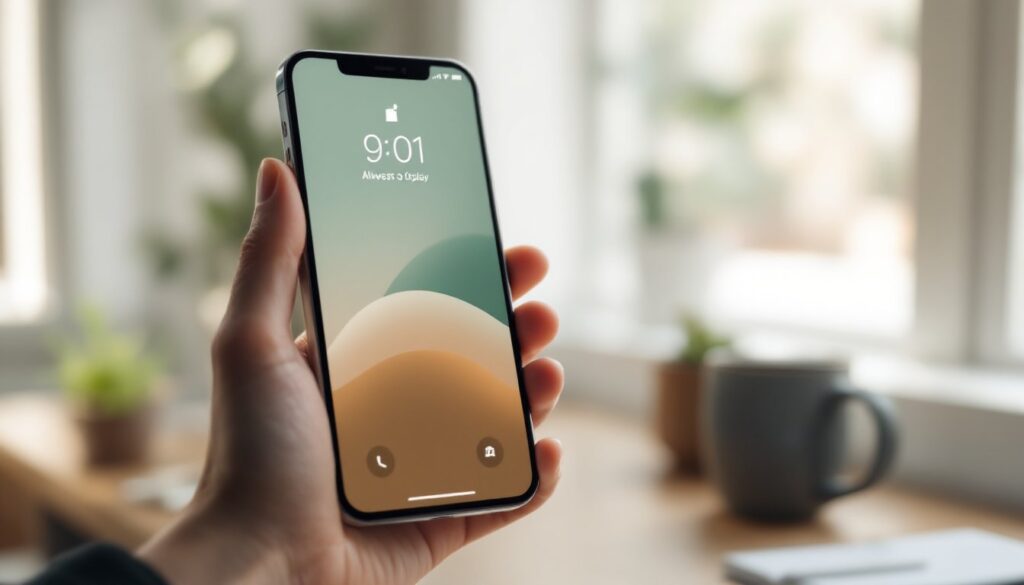
- iPhone wallpaper selection matters more on modern Pro models with always-on OLED displays, since darker images consume less battery while lighter patterns improve contrast for the home screen.
- High-resolution sourcing is critical: aim for images at least 1284 x 2778 pixels or higher for Pro Max devices to avoid pixelation on Super Retina XDR screens.
- DIY wallpaper creation through photo editing, text overlays, or design apps adds intentionality and personalization, while dedicated apps like Unsplash and Reddit communities offer curated, high-quality options.
- Seasonal rotation of wallpapers—whether nature scenes or mood-based designs—mirrors intentional interior design practices and keeps your visual environment fresh without overwhelming the interface.
Why Your iPhone Wallpaper Matters More Than You Think
A wallpaper sets the visual tone for everything else on your screen. App icons, notification badges, and widgets all sit on top of it, so contrast and composition directly affect usability. A cluttered or high-contrast background can make text harder to read and icons harder to distinguish. Conversely, a thoughtfully chosen image with negative space around edges and center can improve legibility and reduce visual fatigue.
With always-on displays now standard on iPhone 14 Pro and newer, your wallpaper shows even when the device is locked. That means color temperature, brightness, and detail level influence battery life and ambient aesthetics. Darker images with fewer bright pixels consume less power on OLED panels. If you keep your phone on a desk or nightstand, the wallpaper becomes part of the room’s visual landscape, not unlike choosing paint colors or cabinet finishes in a kitchen remodel.
Finally, personalization affects how you interact with your device. A wallpaper that sparks a positive emotional response, whether it’s a favorite hiking trail, a piece of abstract art, or a photo of your dog, can subtly shift your mood each time you unlock the screen. It’s a small detail, but it compounds over thousands of daily interactions.
Minimalist Wallpaper Designs for a Clean, Modern Look
Minimalist wallpapers strip away visual noise, leaving you with solid colors, gentle gradients, or simple geometric shapes. This approach mirrors the clean lines and uncluttered surfaces you’d find in contemporary interior design, think Scandinavian kitchens or Japanese-inspired living rooms. The benefit on a phone screen is immediate: app icons and text pop without competing for attention.
Solid colors work best when they’re slightly desaturated. A muted sage green, soft charcoal, or warm beige provides enough contrast for white or black text without overwhelming the eye. Avoid pure white or pure black unless you’re aiming for maximum contrast: mid-tones are easier to look at over long periods. Gradients, especially subtle two-tone fades from one neutral to another, add depth without busyness. Look for gradients that shift from top to bottom rather than radial patterns, since iOS places the dock and app grid in predictable zones.
Geometric minimalism is another strong route. Single-line drawings, overlapping circles, or grid-based compositions echo the precision of architectural drafting. These designs often leave the center of the screen open, which is ideal if you use widgets or want your app icons to remain the focal point. When sourcing minimalist wallpapers, pay attention to resolution, flat colors can reveal compression artifacts or banding on high-DPI OLED displays, so aim for PNG files at 1290 x 2796 pixels or higher for newer Pro Max models.
Nature-Inspired iPhone Wallpapers to Bring the Outdoors In
Nature imagery taps into the same psychology that drives biophilic design in homes, integrating natural elements to reduce stress and improve focus. On an iPhone screen, that can mean anything from macro shots of moss and bark to sweeping mountain vistas or underwater coral scenes. The key is choosing images with a clear focal point and balanced composition so they don’t clash with your app layout.
Landscape photography works well when the horizon line sits in the upper or lower third of the frame, leaving negative space for your home screen icons. A forest trail disappearing into mist, a desert dune at golden hour, or a coastline at dawn all provide visual interest without crowding the interface. Avoid centered horizons or busy foregrounds that cut through the middle of the screen, those tend to make text and icons harder to parse.
Close-up textures, leaves, water droplets, sand ripples, wood grain, offer a tactile quality that contrasts nicely with the glass and aluminum of the device itself. These images often feature limited color palettes, which keeps them from feeling chaotic. When selecting nature wallpapers, consider seasonal rotation. A snow-dusted pine branch in January, wildflowers in April, and amber foliage in October can subtly mark the passage of time, much like modern interior design rotates textiles and accents through the year.
For always-on displays, choose nature images with darker exposure or natural shadows. A nighttime forest or deep ocean scene will save battery while still delivering the calming effect you’re after.
Bold Patterns and Textures for Statement-Making Screens
If minimalism feels too sterile and nature too predictable, bold patterns and textures offer a third path. Think repeating geometric shapes, high-contrast line art, or abstract compositions that lean into color and energy. This category borrows from textile design, mid-century modern graphics, and contemporary art movements, visual strategies that feel at home in a loft with exposed brick or a dining room with statement wallpaper.
Geometric patterns, chevrons, hexagons, tessellations, create rhythm and movement. They work best when the repeat is tight enough to avoid large empty zones but loose enough that individual shapes don’t compete with app icons. Scale matters: a pattern that looks great on a desktop monitor can feel overwhelming on a 6.1-inch screen. Look for designs where the pattern density is calibrated for mobile viewing distances (typically 10–14 inches from your face).
Abstract textures like watercolor washes, ink splatters, or marbled paper add organic unpredictability. These images often feature multiple colors blending into one another, which can either enhance or hinder legibility depending on contrast. If you’re drawn to busy abstracts, test them with your actual home screen layout before committing. Place a few app icons over the image in your Photos app to see if text remains readable.
High-contrast line art, think bold black strokes on white, or neon outlines on black, delivers maximum visual punch. This style mirrors the graphic boldness of modern product design and works especially well on OLED screens where true blacks save power. Just be mindful of how the pattern interacts with your dock and notification badges: too many intersecting lines can create visual confusion.
Personalized and DIY Wallpaper Ideas for Your iPhone
Mass-produced wallpapers have their place, but creating or customizing your own adds a layer of intentionality, similar to painting an accent wall instead of leaving builder-grade beige. DIY wallpapers can be as simple as cropping a favorite photo or as involved as building a custom illustration in a design app.
Photo cropping and editing is the most accessible route. Take a high-resolution photo, your own or a Creative Commons image, and use an app like Snapseed or Lightroom Mobile to adjust exposure, saturation, and crop. For iPhone 14 and newer, crop to a 9:19.5 aspect ratio to avoid awkward scaling. Boost contrast slightly to ensure app icons remain legible, and consider adding a subtle vignette to darken edges and keep the visual weight toward the center.
Text-based designs let you feature a favorite quote, reminder, or inside joke. Use Canva or Over to layer text over a simple gradient or solid color. Keep font sizes large, at least 48pt, and stick to sans-serif typefaces for maximum readability at small sizes. This approach mirrors the function of a chalkboard wall in a kitchen or a framed print in a hallway: it’s both decorative and communicative.
Collage and composition tools like PicsArt or Adobe Express let you combine multiple images, shapes, and textures into a single wallpaper. This works well if you want to visually represent a theme, say, a travel collage from a recent trip or a mood board for a home renovation project. Just keep layering minimal: too many elements create the same problem as a cluttered countertop.
Where to Find and Download High-Quality iPhone Wallpapers
Sourcing wallpapers is straightforward, but quality varies wildly. Low-resolution images look fine as thumbnails but pixelate or blur when stretched across a 6.7-inch Super Retina XDR display. Aim for images at least 1284 x 2778 pixels for standard models, and higher for Pro Max devices.
Dedicated wallpaper apps like Unsplash, Vellum, and Walli curate high-resolution images optimized for mobile. Unsplash in particular sources from professional photographers and offers completely free downloads with no watermarks. Vellum and Walli lean more toward illustration and abstract art, often featuring work from independent designers. Most of these apps let you filter by color, category, or orientation, which speeds up the hunt.
Stock photo sites, Pexels, Pixabay, and Unsplash’s web version, provide massive libraries of free images. Use search filters to specify minimum resolution and aspect ratio. Download the largest available file: you can always crop or scale down, but upscaling a small image introduces artifacts.
Designer portfolios and platforms like Dribbble, Behance, and ArtStation showcase custom wallpapers, often as free downloads or part of paid packs. These tend to skew more artistic and niche, great if you want something that doesn’t show up on a million other phones. Some designers release seasonal packs or themed collections, similar to how home design platforms rotate editorial content around trends and seasons.
Reddit communities, r/iWallpaper and r/Amoledbackgrounds, are active hubs where users share and request wallpapers. The Amoled subreddit focuses on dark, battery-friendly images ideal for OLED screens. Both communities have strict resolution and quality standards, so the signal-to-noise ratio is higher than general image search.
Before downloading, check file format. JPEG is fine for photos, but PNG is better for graphics, text, or images with transparency. Avoid heavily compressed files, if the file size is suspiciously small (under 500 KB for a full-res image), it’s likely been over-compressed and will look muddy on a high-DPI display.
Conclusion
Your iPhone wallpaper is a daily touchpoint, a small design decision that compounds across thousands of interactions. Whether you lean toward minimalist geometry, nature photography, bold patterns, or custom creations, the right image should improve usability and reflect your aesthetic preferences. Prioritize high resolution, test legibility with your actual home screen layout, and don’t hesitate to rotate wallpapers seasonally or by mood. Treat it like you’d treat any other design element in your environment: intentional, functional, and worth the few minutes it takes to get right.