Choosing the right colors for a patio doesn’t just affect curb appeal, it changes how the space functions, how often it gets used, and how well it holds up under sun and weather. A smart color scheme can make a cramped concrete slab feel like an outdoor room or turn a sprawling deck into a cohesive extension of the house. Whether working with painted concrete, stained wood, tile, or pavers, color decisions impact everything from surface temperature to maintenance schedules. This guide breaks down proven patio color palettes, explains how different hues perform in real-world conditions, and walks through the selection process with practical considerations for climate, architecture, and material compatibility.
Table of Contents
ToggleKey Takeaways
- Patio color choices directly impact heat absorption, visual integration with your home, and long-term durability—dark surfaces can reach 20-30°F higher temperatures than light alternatives on sunny days.
- Warm tones like terracotta and rust create inviting atmospheres and work best in mild climates or shaded areas, while cool grays and blues recede visually and keep surfaces cooler underfoot.
- Earth-tone stains and mineral-based pigments resist UV fading better than organic colors, lasting 3-5 years before repainting is needed, especially on exposed horizontal surfaces.
- Apply the 60-30-10 design rule for bold patio color ideas: 60% neutral base, 30% secondary color, and 10% accent color to maintain visual balance without overwhelming the space.
- Test patio colors in situ with 12×12-inch sample boards placed at different times of day for 3-5 days, as lighting dramatically shifts color perception from morning through evening.
- Match your patio colors to architectural style, climate, and existing exterior finishes—neutral palettes offer the most flexibility for seasonal updates and resale appeal.
Why Patio Color Choices Matter for Your Outdoor Living Space
Patio colors influence three critical factors: heat absorption, visual flow with the home’s exterior, and long-term durability. Dark surfaces, charcoal, deep brown, or black, can reach surface temperatures 20-30°F higher than lighter alternatives on sunny days, making them uncomfortable barefoot and increasing cooling loads for adjacent interior rooms. Light colors reflect more UV radiation, staying cooler but showing dirt and organic staining more readily.
Color also dictates how the patio integrates with the home’s architecture. A brick Tudor looks balanced with warm terracottas or sage greens, while a modern farmhouse pairs better with soft grays or weathered whites. Mismatched palettes create visual tension that’s hard to fix without resurfacing.
Finally, certain pigments fade faster than others. Earth-tone stains and mineral-based paints (iron oxide reds, ochres) resist UV degradation better than organic blues and greens, which can shift toward gray within two to three seasons in full sun. For painted concrete or stained wood, budget for reapplication every 3-5 years depending on exposure and product quality. Clear sealers with UV inhibitors extend color life but require recoating every 18-24 months to maintain protection.
Warm and Inviting Patio Color Palettes
Warm tones, reds, oranges, yellows, and their muted derivatives, create a welcoming atmosphere and pair naturally with wood, stone, and clay materials. These palettes work especially well in Mediterranean, Spanish Colonial, and Craftsman homes where architectural details already lean warm.
Terracotta, Rust, and Earthy Tones
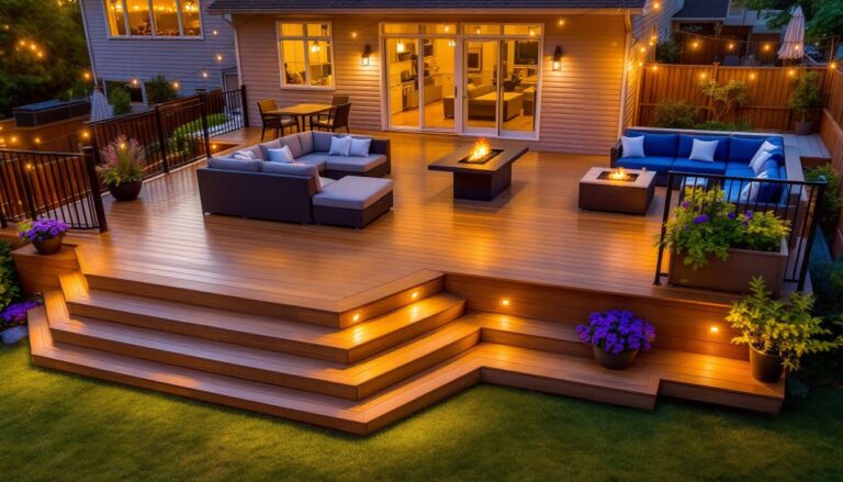
Terracotta and rust tones mimic natural clay and adobe, making them ideal for stamped concrete, tile, or stained pavers. These colors absorb moderate heat, not as extreme as black but warmer than tan, so they’re best in climates with mild summers or patios with partial shade. Terracotta concrete stain typically covers 200-300 square feet per gallon and penetrates the surface rather than forming a topcoat, which reduces peeling.
Pair terracotta floors with cream or sand-colored walls and wrought iron or dark bronze furniture for a classic Southwest look. Add accent colors like turquoise or cobalt blue in cushions or pottery to create contrast without clashing. For colorful patio ideas, layer in burnt orange umbrellas, saffron yellow planters, or deep red outdoor rugs.
On wood decks, consider semi-transparent stains in cedar or redwood tones. These allow the grain to show through while adding warmth. Products like Behr’s Semi-Transparent Waterproofing Stain in “Redwood Naturaltone” provide UV protection and water repellency, but they require reapplication every 2-3 years on horizontal surfaces. Always test stain on a hidden board or scrap piece, color shifts as it dries and weathers.
Safety note: When applying stains or sealers, wear nitrile gloves, safety glasses, and a respirator rated for organic vapors if working in an enclosed area. Work in well-ventilated conditions and keep a fire extinguisher nearby, many stains are oil-based and flammable during application.
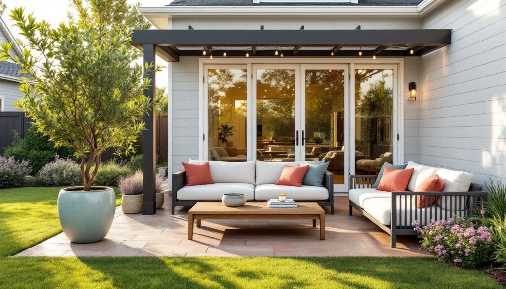
Cool and Calming Patio Color Schemes
Cool palettes, blues, greens, grays, and purples, lower visual temperature and create a restful mood. They’re popular in coastal, contemporary, and cottage-style homes. Cool colors also tend to recede visually, making small patios feel more spacious.
Slate gray and blue-gray concrete or pavers stay cooler underfoot than warm tones and hide water stains better than pure white. Concrete overlay systems like Behr’s Premium Decorative Concrete Overlay can be tinted to custom grays and applied at ⅜-inch thickness over existing slabs, though this adds structural load, verify the slab can handle it, especially if it’s already settling.
Sage green and soft aqua work well as accent colors on pergola posts, planter boxes, or outdoor furniture. For wooden structures, exterior acrylic latex paint in these hues holds up better than oil-based alternatives, which yellow over time. A quality exterior paint covers roughly 350-400 square feet per gallon on smooth surfaces: rough-sawn lumber or heavily weathered wood may require a second coat.
Combine cool floor tones with natural wood furniture in teak or eucalyptus and white or off-white cushions. This combination appears frequently in contemporary patio designs where minimalism and comfort intersect. Add pops of navy, coral, or lemon yellow in throw pillows to prevent the space from feeling sterile.
Pro tip: If painting pressure-treated lumber, wait at least 6 months after installation for the wood to dry and for chemical treatments to leach out. Premature painting leads to adhesion failure and peeling within a season.
Bold and Vibrant Patio Color Combinations
High-contrast, saturated color schemes create energy and personality but require careful balancing to avoid visual chaos. Bold palettes suit eclectic, tropical, and modern homes where the outdoor space functions as an entertainment zone.
Cobalt blue paired with sunny yellow or tangerine orange delivers a Mediterranean or Mexican-inspired look. Use the boldest color sparingly, on a single accent wall, a built-in bench, or large planters, and let neutral floors and furniture anchor the scheme. Concrete floors in light gray or buff provide a calm base that won’t compete with vivid accents.
For colorful patio ideas that feel cohesive, stick to a 60-30-10 rule: 60% neutral (floor, large furniture), 30% secondary color (cushions, umbrellas, rugs), and 10% bold accent (pillows, pottery, artwork). This prevents the space from feeling like a paint store exploded.
Emerald green and deep plum create a jewel-tone palette that works in shaded patios surrounded by lush landscaping. These colors recede in low light, so they’re less overwhelming than they sound. Pair with natural stone pavers in gray or tan and black metal furniture for a sophisticated, garden-party vibe that’s popular in curated outdoor furniture collections.
When painting outdoor fabric or applying color to cushions, use fabric medium mixed with exterior acrylic paint or purchase marine-grade outdoor fabric paint. Standard interior craft paint fades and cracks within weeks outdoors. UV-resistant fabrics like Sunbrella come in hundreds of colors and resist fading for 5-7 years with minimal care.
Safety note: Spray painting furniture or large surfaces outdoors? Wear a respirator with organic vapor cartridges, not just a dust mask. Overspray travels farther than it looks, so work away from vehicles, windows, and plantings. Lay down drop cloths, paint mist settles on everything within 10 feet.
Neutral Patio Colors for Timeless Appeal
Neutral palettes, beiges, tans, grays, whites, and soft browns, offer flexibility, longevity, and the widest resale appeal. They’re forgiving with furniture changes and landscaping updates, and they don’t compete with seasonal decor.
Sandstone, travertine, and limestone pavers in natural buff or tan tones stay cool, hide dirt reasonably well, and complement nearly any architectural style. Natural stone costs $15-30 per square foot installed (prices vary by region and availability), but it lasts decades with minimal maintenance. Sealed stone resists staining and simplifies cleaning, reseal every 3-5 years depending on traffic and weather exposure.
For concrete, consider integral color rather than topical stains. Integral pigments are mixed into the concrete during batching, so the color runs through the entire slab. If the surface chips or wears, the color remains consistent. This costs $1-2 more per square foot than gray concrete but eliminates resealing and recoloring. Popular neutral integral colors include Brownstone, Adobe Buff, and Slate Gray.
Whitewashed or pickled wood decks offer a coastal, Scandinavian vibe. Achieve this with a semi-solid stain in white or driftwood gray applied over clean, bare wood. The stain partially obscures the grain while allowing texture to show. This finish hides wear better than solid paint but requires reapplication every 3-4 years.
Neutral floors provide a blank canvas for colorful patio ideas in furniture and accessories. Swap out cushions, rugs, and planters seasonally without repainting or refinishing the hardscape. This flexibility matters if design trends shift or if household tastes change, a neutral base adapts without costly overhauls.
Pro tip: When matching new pavers or concrete to existing work, bring a sample piece to the supplier. Colors shift between batches and manufacturers. A “buff” paver from one maker may be noticeably yellower or grayer than another’s, creating visible patchwork.
How to Choose the Right Patio Colors for Your Home
Start by evaluating three factors: architectural style, climate, and existing exterior colors. The patio shouldn’t look like an afterthought, it should feel like a deliberate extension of the home’s design language.
Match architectural style first. Craftsman homes pair well with earth tones and forest greens. Mid-century modern homes suit neutrals with pops of mustard, burnt orange, or teal. Colonial or Cape Cod styles lean toward grays, blues, and whites. If unsure, study similar homes with successful patio designs and note recurring color themes.
Consider climate and sun exposure. In hot, sunny regions (Southwest, Southeast), prioritize light colors that reflect heat. Cool gray, tan, and cream keep surfaces 15-20°F cooler than dark alternatives. In cooler, cloudy climates (Pacific Northwest, Northeast), darker colors can make the space feel warmer and more inviting without causing discomfort. Charcoal, deep brown, or slate absorb available sunlight and dry faster after rain.
Test colors in situ. Paint sample boards (at least 12×12 inches) and place them on the patio at different times of day. Morning, midday, and evening light shift color perception dramatically. A beige that looks warm and inviting at sunrise may appear washed-out and dull at noon. Leave samples out for 3-5 days to see how they weather and accumulate dust.
Coordinate with trim, siding, and roofing. Pull accent colors from existing exterior finishes. If the house has red brick, echo that warmth in terracotta or rust tones. If siding is gray with white trim, consider a gray patio floor with white or cream furniture. Avoid creating a fourth or fifth color family that has no relationship to the home, it fragments the visual flow.
Account for material limitations. Not all colors are available in all materials. Concrete and pavers offer the widest range. Natural stone is limited to earth tones. Composite decking comes in grays, browns, and tans but rarely in bold colors. If a specific color is critical to the design, choose materials that can deliver it without custom fabrication.
Plan for long-term maintenance. Lighter colors show stains, mold, and mildew more readily and may require pressure washing 1-2 times per year. Darker colors fade faster but hide surface grime. Budget time and money for upkeep, beautiful patios don’t stay that way without regular care.
Finally, involve the household in the decision. The patio is a shared space, and buy-in matters. A color scheme that checks all the technical boxes but makes the family uncomfortable won’t get used, which defeats the purpose of the project.